Sleep
or die
Sleep is essential… and ignored. Most sleep brands feel soft, clinical, or preachy; none match the intensity of modern life or the internet’s cadence.
The goal: create a Gen-Z targeted brand that meets people where they are, scrolling, overstimulated, self-aware, and uses sharp, memorable creative to make better sleep feel urgent, obvious, and desirable.
Sleep Or Die™ is a bold, anti-traditional brand creating innovative sleep products for a world in desperate need for better sleep.
The project set out to define a distinct position, voice, and visual system that could cut through wellness noise and spark a “sleep revolution.” The work needed to feel brutally honest, culturally fluent, and built for virality.
brand strategy & positioning
visual identity system
CPG packaging (copy & design)
social/content strategy
website design & development
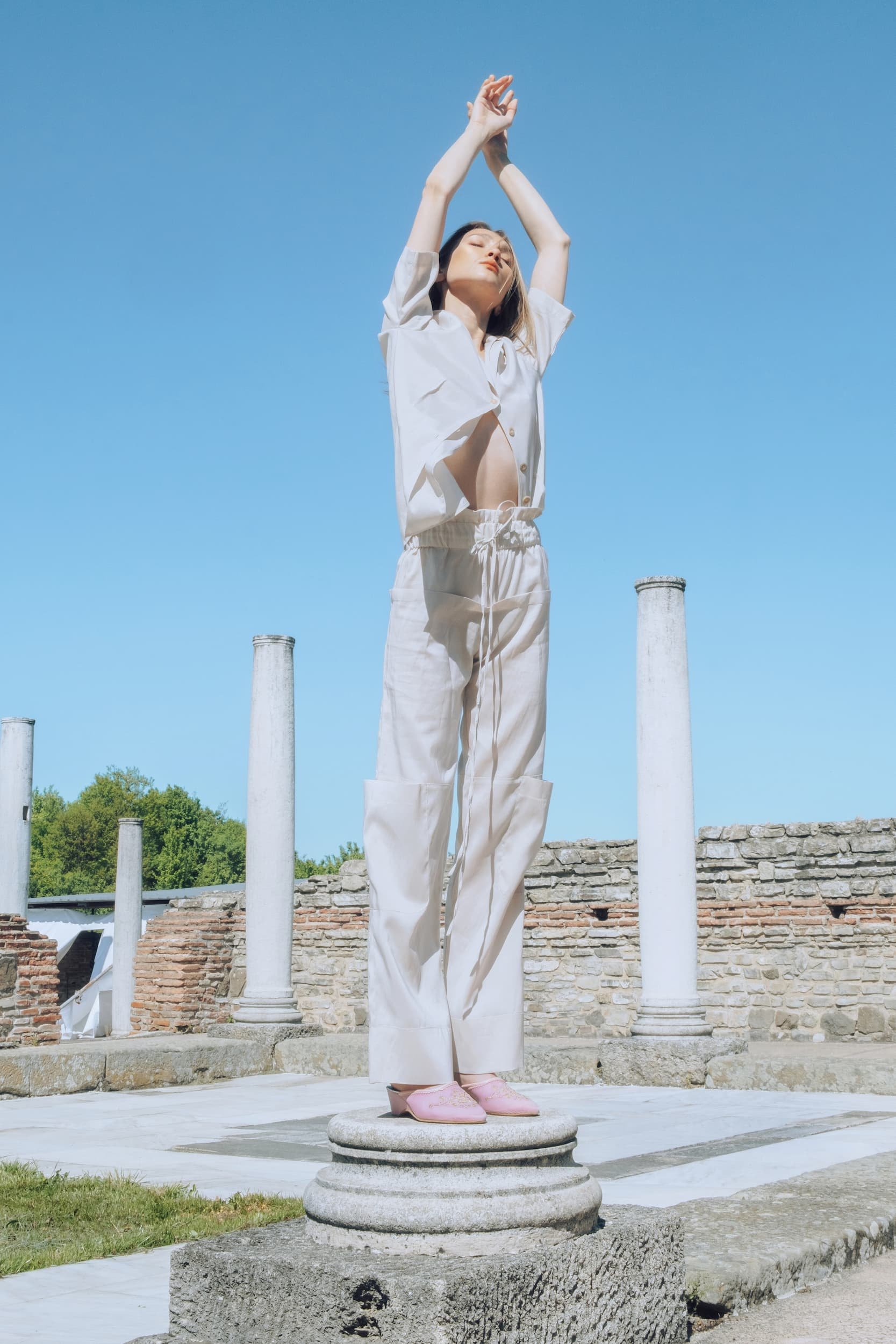
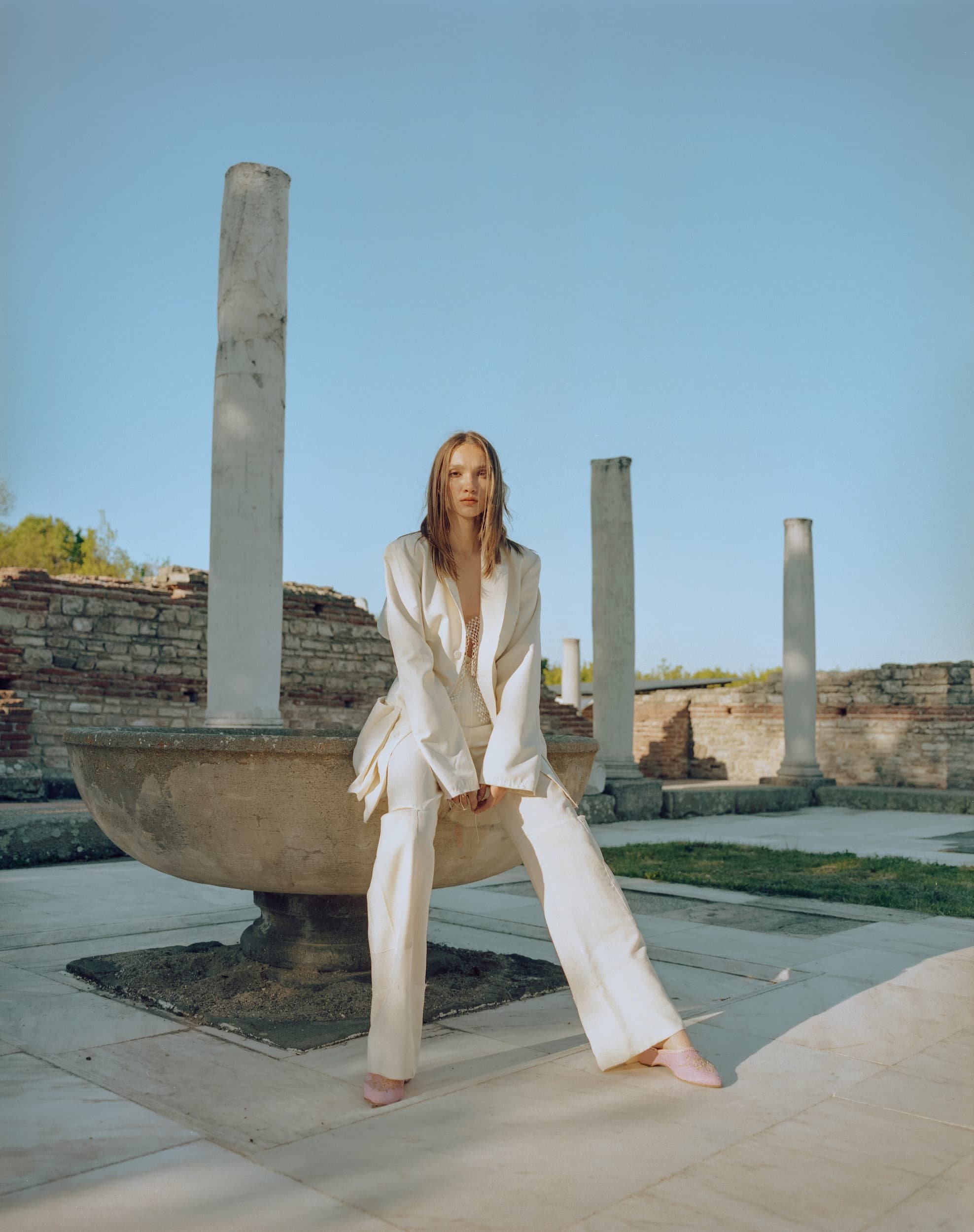
product & brand photography

The engagement began with positioning the brand as the honest disruptor in sleep, plain-spoken, culture-literate, and unafraid to call out the problem. Strategy translated into a voice system built on brutal clarity, wit, and brevity, paired with visual direction that favours low-lift, high-impact content.
The brand now has a powerful identity and a bold, unmistakable voice that stands apart from wellness clichés. The website design reinforces this disruptive positioning; built to feel raw, fast, and scroll-friendly while guiding visitors clearly toward product education and purchase. Paired with strong packaging and product messaging, the site creates a seamless path from curiosity to conversion.